Last week we announced the launch of our new UI for JangoSMTP users. Today, we’d like to show you around.
First, let’s take a look at navigation. We’ve redesigned and reorganized the interface to make it faster and more intuitive to get things done. Here's the old Welcome Page:
Here's the new Dashboard:
The Reports section is also a lot sleeker now. We know how important good reporting is to the success of your campaigns, so we worked hard to take user feedback into account to better organize your reports. Take a look. Here's the old Reports Dashboard:
Here's the Reports Dashboard in the new UI:
In addition to being more aesthetically pleasing, Settings has been streamlined so that you can configure your account more easily, and we’ve improved our contextual help so that even new SMTP users can feel comfortable getting under the hood:
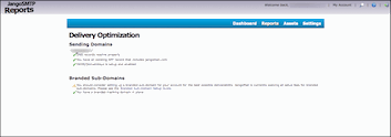
We’ve also built a number of tools into the new UI that we think you’ll like. We’ve made it easier to access deliverability tools like the Delivery Health Check and Delivery Optimizer and also created new features like the ability to easily upload assets to our server. Here are some of the tools you’ll see in the new UI:
We’ve even made it easier to manage your account, monitor your use, and keep your contact and billing information up to date.
These are just some of the changes you’ll see in the redesigned JangoSMTP. After a year in the works, we’re excited about the new UI and hope you are too. If you have any feedback or questions, please don’t hesitate to contact us.


